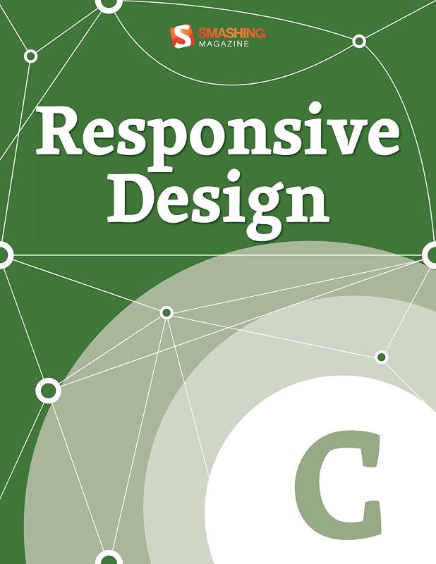
Responsive Design (Smashing eBook Series 23) by Smashing Magazine

Responsive Design (Smashing eBook Series 23)

Smashing Magazine
163 pages
Smashing Media GmbH
May 2012
Hardcover
Computers & Internet WSBN
0
Readers
0
Reviews
0
Discussions
0
Quotes
This eBook, "Responsive Design", gives an overview about responsive Web design, showing many situations and techniques in which this approach can be applied to. Smartphones, tablets, laptops and desktop computers may share the same design, which is adapted according to screen size, platform and orientation of each device. Flexible grids and layouts, images, text and an intelligent use of CSS media queries are included.. TABLE OF CONTENTS. - Responsive Web Design: What It Is and How To Use It- Progressive And Responsive Navigation- Techniques For Gracefully Degrading Media Queries- Is There Ever A Justification For Responsive Text?- How To Use CSS3 Media Queries To Create a Mobile Version of Your Website- Device-Agnostic Approach To Responsive Web Design- Content Prototyping In Responsive Web Design
Join the conversation

No discussions yet. Join BookLovers to start a discussion about this book!

No reviews yet. Join BookLovers to write the first review!

No quotes shared yet. Join BookLovers to share your favorite quotes!

Earn Points
Your voice matters. Every comment, review, and quote earns you reward points redeemable for Bitcoin.
Comment +5 pts Review +20 pts Quote +7 pts Upvote +1 pt
BookMatch Quiz
Find books similar to this one
About this book
Pages 163
Publisher Smashing Media GmbH
Published 2012
Readers 0