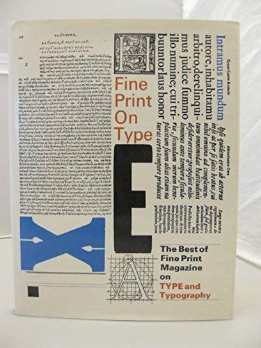
Fine Print on Type: The Best of Fine Print on Type and Typography, 1977-1988 by Charles Bigelow

Fine Print on Type: The Best of Fine Print on Type and Typography, 1977-1988

Charles Bigelow
147 pages
Noel W Kirshenbaum
Jan 1989
Paperback
Computers & Internet WSBN
0
Readers
0
Reviews
0
Discussions
0
Quotes
A collection of essays on type design and typography, written by some of the foremost designers and scholars in the field. Appeals to those who use, study, and love type - from advertising designers to desktop publishers, from research bibliographers to just plain discerning readers. TYPE, seemingly a neutral conveyor, can radically affect the meaning and impact of the message. Types covered include the up-to-date and quotidian like ITC Zapf Chancery, Galliard, and Century, as well as little-known but interesting historical faces like Fleischmann Antiqua, Hiero-Rhode Italic, and Hammer Uncial. Here sixteenth- and seventeenth-century type designers like Claude Garamond and Miklos Kis share the stage with the "bit wizards" of our own time like Kris Holmes and Sumner Stone.
Join the conversation

No discussions yet. Join BookLovers to start a discussion about this book!

No reviews yet. Join BookLovers to write the first review!

No quotes shared yet. Join BookLovers to share your favorite quotes!

Earn Points
Your voice matters. Every comment, review, and quote earns you reward points redeemable for Bitcoin.
Comment +5 pts Review +20 pts Quote +7 pts Upvote +1 pt
BookMatch Quiz
Find books similar to this one
About this book
Pages 147
Publisher Noel W Kirshenbaum
Published 1989
Readers 0